Prologue:
I first intended to practice data processing and visualization with python. I found average salaries by occupation dataset from Bank of Thailand’s website and decided to see if I can organize and make sense of it.
Sources:
Bank of Thailand (EC_RL_018 for average salaries by occupation, EC_RL_012 for number of wokers by occupation, and EC_EI_027 for inflation)
Disclaimer:
As my background in economics is limited, some terms/parameters might not be used/defined properly. Please let me know if there are parts that require fixing or clarification.
If you are not interested in seeing codes, please click here for a page with only discussions and plots.
import libraries
import csv
import numpy as np
import pandas as pd
import matplotlib.pyplot as plt

import seaborn as sns
sns.set_style("whitegrid")

from datetime import datetime
Import and organize data
Let’s not get into detail here but briefly three datasets are imported and cleaned up. The dataset with average salaries serves as the core of the analysis. Datasets with number of workers in different job categories and with inflation are used as supplements.
First few rows of core data
The table below shows that the data of average salaries (Thai Baht/month) was collected by quarter and separates occupations into ten categories.
- Legislators, senior officials, managers = ผู้บัญญัติกฎหมาย, ข้าราชการระดับอาวุโส, ผู้จัดการ
- Professionals = ผู้ประกอบวิชาชีพด้านต่างๆ
- Technicians, associate professionals = ช่างเทคนิคสาขาต่างๆ และวิชาชีพอื่นๆ ที่เกี่ยวข้อง
- Clerks = เสมียน
- Service/sales workers = พนักงานบริการ/พนักงานขาย
- Skilled agricultural/fishery workers = ผู้ปฏิบัติงานที่มีฝีมือในด้านการเกษตรและการประมง
- Craftsmen/related trades workers = ผู้ปฏิบัติด้านงานฝีมือและอื่นๆ ที่เกี่ยวข้อง
- Plant and machine operators/assemblers = ผู้ปฏิบัติการเครื่องจักรโรงงานและด้านการประกอบ
- Elementary occupations = อาชีพขั้นพื้นฐาน/ผู้ใช้แรงงานด้านต่างๆ
- Others = อื่นๆ นอกเหนือจากข้างต้น
The first column is All Average = เฉลี่ยรวมทุกกลุ่มอาชีพ.
df = pd.DataFrame(data, index=time, columns=categories)

# get the earliest period to come first
df = df.sort_index()

df.head()
| All average | Legislators, senior officials, managers | Professionals | Technicians, associate professionals | Clerks | Service/sales workers | Skilled agricultural/fishery workers | Craftsmen/related trades workers | Plant and machine operators/assemblers | Elementary occupations | Others | |
|---|---|---|---|---|---|---|---|---|---|---|---|
| 2001-Dec | 6760.99 | 25007.92 | 17130.21 | 11212.18 | 8782.69 | 5651.82 | 2538.43 | 4755.04 | 5480.45 | 3019.81 | 18932.41 |
| 2001-Jun | 6626.39 | 22457.16 | 16338.63 | 10525.27 | 8785.40 | 5627.14 | 2408.48 | 4610.43 | 5310.26 | 3228.18 | 21421.54 |
| 2001-Mar | 6501.65 | 22332.81 | 16655.97 | 10245.75 | 8684.23 | 5655.47 | 2901.34 | 4533.36 | 5207.83 | 3119.17 | 10469.74 |
| 2001-Sep | 6763.97 | 24830.83 | 17629.49 | 10742.04 | 8837.85 | 5567.03 | 2160.87 | 4764.41 | 5247.38 | 3446.14 | 14176.03 |
| 2002-Dec | 6689.32 | 22252.23 | 18473.05 | 10945.62 | 8795.00 | 5599.01 | 2741.83 | 4937.75 | 5553.20 | 3183.74 | 14607.88 |
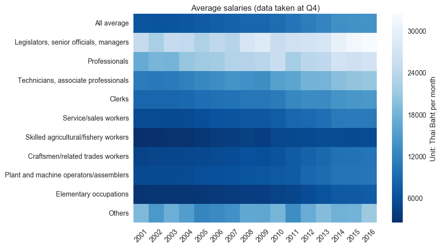
Average salaries of different jobs
Only data from quarter 4 is presented as annual data in the heatmap plot below.
The plot shows that the grop of Legislators, senior officials, managers consistently has the higest average salary while the groups of Skilled agricultural/fishery workers and Elementary occupations always stay at the bottom.
from matplotlib.ticker import ScalarFormatter
cbar_fmt = ScalarFormatter(useMathText=True)
cbar_fmt.set_powerlimits((-2, 5))

annual = df[::4]

ax = sns.heatmap(annual.transpose(), cmap='Blues_r', cbar_kws={'label':'Unit: Thai Baht per month', 'format':cbar_fmt})
ax.set_xticklabels([annual.index[x][0:4] for x in range(annual.shape[0])], rotation=45)
ax.set_title('Average salaries (data taken at Q4)')

plt.show()
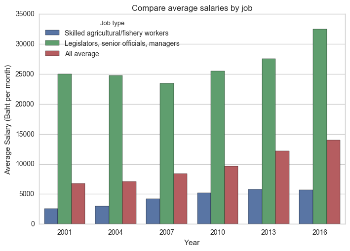
Comparing jobs with low and high salary
The difference in salary between the groups with the lowest and highest average salaries is drastic. In the beginning period of the data, the salary of the latter group was 10 times higher than that of the former.
Looking more closely, however, reveals that the group with low salary does better in terms of salary growth. The low salary group shows consistent increase in salary while the latter experienced some fluctuation during the years.
At the end of the data, the ratio between salaries of the groups with the highest and lowest average salary has reduced to 5 times. In terms of trend, the average salary of all groups of workers resembles that of the group with lower salary because there are more workers in these groups compared to workers in groups with high salary. For a quick check, here is a chart plotted using a separate dataset showing the distribution of number of workers in different occupations in 2001 and 2016.
yearStep = 3

annualBar = annual.iloc[::yearStep,[6,1,0]].sort_index()
annualBar['Year']=annualBar.index

annualBar_melt = pd.melt(annualBar, id_vars='Year', value_name='Average salary', var_name='Job type')
ax = sns.barplot(x='Year', y='Average salary' , hue='Job type', data=annualBar_melt)
ax.set_xticklabels([x for x in range(2001,2017,yearStep)], rotation=0)
ax.set_title('Compare average salaries by job')
ax.set_ylabel('Average Salary (Baht per month)')
ax.set_ylim(0, 35000)
plt.show()
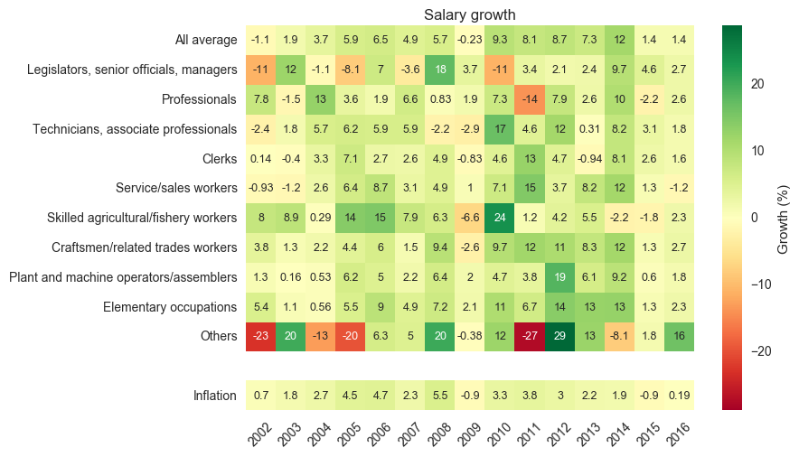
Salary growth
From the previous observation, it is interesting to see how the growth rates of salary of workers in different occupations perform comparing to the country’s inflation rate (headline inflation).
The heatmap plot below shows that the Others group suffers the most regarding fluctuation in salary growth. The Legislators, senior officials, managers group with the highest salary comes in as the second that suffers from strong fluctuation. The growth rate of salary of each groups decreases with average salary and becomes more similar to the trend of inflation.
This makes sense as most of workers in the workforce are in groups with low average salary and their collective spending contributes more toward the country’s economy compared to people in the groups with high salary.
# calculate annual growth in %
growth = annual.pct_change()[1:]*100
growth[''] = 0
growth['Inflation'] = inflation_headline[1:] # from 2002 to 2016

ax = sns.heatmap(growth.transpose(), cmap='RdYlGn', annot=True, annot_kws={'fontsize':'9'}, fmt='.2g', cbar_kws={'label':'Growth (%)'}, mask=growth.transpose()==0)
ax.set_xticklabels([growth.index[x][0:4] for x in range(growth.shape[0])], rotation=45)
ax.set_title('Salary growth')

plt.show()
Spending power (normalized to itself in 2001 and accumulated inflation)
One way to see how individual workers experience the value of their income is to look at changes in normalized spending power. In this case the spending power for each job category is defined as follows.
\[Power(Year) = \dfrac{Income(Year)}{Income(2001) \times Acc_{inflat}(Year)}\]where \(Acc_{inflat}(Year)\) is monetary value change due to accumulated inflation since 2001 (i.e. this term equals 1 in 2001).
This factor can be calcualted using the expression below.
\[Acc_{inflat}(Year) = \prod\limits_{y=2001}^{Year} \big(1+Inflation(y)\big)\]where \(Inflation(y)\) is the value of inflation in a specific year.
By looking at this number, one can quickly identifies that a certain group of workers in year X will be able to have the same, better, or worse living conditions compared to theirs in 2001 when \(Power(X)\) is equal to, greater, or smaller than 1.
A heatmap of spending powers for different occupations is shown below.
ref = annual.iloc[0]

# divide by itself in 2001
power_2001 = annual.divide(ref, axis=1)
# divide by accumulated inflation (2001-2016)
power_2001 = power_2001.divide(accValue_infHead[:-1], axis=0)

ax = sns.heatmap(power_2001.transpose(), cmap='Blues_r', annot=True, fmt='.2g', annot_kws={'fontsize':'9'}, cbar_kws={'label':'', 'format':cbar_fmt})
ax.set_xticklabels([power_2001.index[x][0:4] for x in range(power_2001.shape[0])], rotation=45)
ax.set_title('Spending powers by occupation')

plt.show()
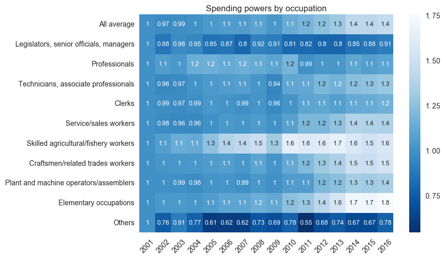
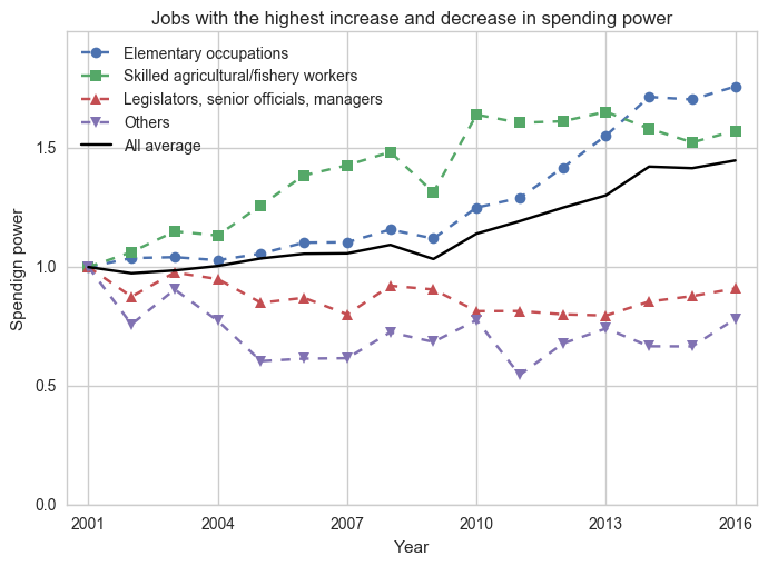
Comparing spending power
The spending power heatmap shows that workers in most occupations have increased spending power compare to theirs in 2001. Interestingly the data reveals that groups of workers with high salary experiences less increase or even decrease in their spending power over time.
The two groups that see reduction in their spending over this period are Legislators, seniors, managers and Others. Theses two are groups with the highest and the third highest average salaries.
The groups that see the highest and the second highest increase in their spending power are Elementary occupations and Skilled agricultural/fishery workers, respectively. They are the groups with the second lowest and the lowest average salaries of this 16-year period dataset.
ax = power_2001.iloc[:,[-2,6,1,-1,0]].plot(title='Jobs with the highest increase and decrease in spending power', style=['--o','--s','--^','--v','-k'])
ax.set_xlabel('Year')
ax.set_xlim(-0.5,15.5)
ax.set_xticks([x for x in range(0,17,3)])
ax.set_xticklabels([x for x in range(2001,2017,3)], rotation=0)

ax.set_ylabel('Spendign power')
ax.set_ylim(0,1.99)
ax.set_yticks([0.5*x for x in range(0,4)])
ax.legend(loc=2)

plt.show()
Summary and discussions
The data shows that average salaries of workers in Thailand in all occupations have increased over the past 16 years. The growth rates, however, differ from occupation to occupation where occupations with high average salary experience pronounced fluctuation in growth rates. When taking into account the inflation rate, workers in groups with low average salary see consistent increase in their spending power over the length of the dataset. This increase is smaller for groups with higher average salary, and two of them even see their spending power decrease.
Choosing a job?
Based on the observed trend, a compromise between growth and income is inevitable. Note that the data represents ‘average’ salaries. Top people in all categories definitely earn much higher.
Business targets
Business that targets people with high salary might have to consider adjusting their long term strategies to focus more on workers in groups with lower average salary because they are more likely to increase their spending. In addition, changes in distribution of workers in 2001 and 2016 do not reflect significant shift in percentage of people working in jobs with high and low average salary (although there is significant reduction/increase of people in Skilled agriculture/fishery workers and Service/sales workers, respectively); this means they will continue to be the majority for quite sometime
Closing notes
The data and discussions above do not present the state of economy of Thailand as a whole. For that, additional indicators have to be considered such as an inflation rate (lower than 2% since 2014, and negative in 2015) and an unemployment rate.