code ต้นฉบับที่ใช้ในการจัดการข้อมูลและทำ visualization ของ a Medium blog Open Data(Science) Thailand, peeking on government spending
หรือจะคลิกดู raw jupyter notebook ได้ที่นี่
# pandas, geopandas, numpy for working with dataframes and arrays
import pandas as pd
import geopandas as gpd
import numpy as np

# matplotlib for basic plots
import matplotlib.pyplot as plt
%matplotlib inline

# plotly for interactive plots
import plotly.offline as py
from plotly.graph_objs import *
from plotly import tools
py.init_notebook_mode(connected=True)
# set pandas float display to have 2 decimal points and a comma separating every 1000X
pd.options.display.float_format = '{:,.2f}'.format
Import government spending data
# original data from https://data.go.th/DatasetDetail.aspx?id=de82938b-361e-412c-bf30-4a4f2c5e6c3a
# note: the original data was re-encoded to utf8 to work with pandas
govSpendCntrct = pd.read_csv('GovSpending_25601002_contract_utf8.csv',
                   usecols=['proj_no','proj_name','subdep_name','corp_name',
                            'mthd_name', 'typ_name','contrct_price','contrct_date'])

subdep_provnc = pd.read_csv('GovSpending_25601002_department_utf8.csv', usecols=['subdep_name','org_name','provnc'])

govSpendCntrct = govSpendCntrct.merge(subdep_provnc, 'left', on='subdep_name')
govSpendCntrct = govSpendCntrct[['proj_no', 'proj_name', 'subdep_name', 'org_name', 'provnc', 'mthd_name', 'typ_name', 'corp_name', 'contrct_price','contrct_date']]
govSpendCntrct['contrct_date'] = pd.to_datetime(govSpendCntrct['contrct_date'], dayfirst=True)
print('Data from:', govSpendCntrct['contrct_date'].min())
print('Data to:', govSpendCntrct['contrct_date'].max())
print('Total government spending (THB):', govSpendCntrct['contrct_price'].sum())
print('Total orders:', govSpendCntrct.shape[0])
Data from: 2017-08-16 00:00:00
Data to: 2017-10-31 00:00:00
Total government spending (THB): 220732037385.0
Total orders: 811241
govSpendCntrct.sample(5)
get_col = ['proj_name','subdep_name','org_name','provnc','mthd_name','typ_name','corp_name','contrct_price']
govSpendCntrct.sort_values('contrct_price', ascending=False)[get_col].head(20)
Plot relationship between corp_name and contract
list_to_group = ['corp_name']
target = ['contrct_price']

sum_contrct = govSpendCntrct[list_to_group+target].groupby(list_to_group).sum().sort_values(target,ascending=False)
count_contrct = govSpendCntrct[list_to_group+target].groupby(list_to_group).count().sort_values(target,ascending=False)

costPerContrct = (sum_contrct/count_contrct).sort_values(target,ascending=False)
start_date = govSpendCntrct['contrct_date'].min().strftime('%Y/%m/%d')
end_date = govSpendCntrct['contrct_date'].max().strftime('%Y/%m/%d')

count_total = count_contrct.sum()
sum_total = sum_contrct.sum()

count_contrct = count_contrct[:15]
sum_contrct = sum_contrct[:15]
costPerContrct = costPerContrct[:15]

marker = dict(color='rgb(158,202,225)',
              line=dict(color='rgb(8,48,107)',width=1.5),
             )

# if would like rainbow color
barcolors = ['hsl('+str(h)+',50%'+',50%)' for h in range(0, 360, int(360/count_contrct.shape[0]))]
edgescolors = ['hsl('+str(h)+',100%'+',20%)' for h in range(0, 360, int(360/count_contrct.shape[0]))]
marker = dict(color=barcolors,
              line=dict(color=edgescolors,width=1.5),
             )

trace_count = Bar(
                x=count_contrct.index,
                y=count_contrct['contrct_price'],
                text=['%.2f%% of total' % percent[0] for percent in (count_contrct/count_total*100).values],
                marker=marker,
                opacity=0.7,
                name='count'
                )
trace_sum = Bar(
                x=sum_contrct.index,
                y=sum_contrct['contrct_price'],
                text=['%.2f%% of total' % percent[0] for percent in (sum_contrct/sum_total*100).values],
                marker=marker,
                opacity=0.7,
                name='sum value'
                )
trace_avg = Bar(
                x=costPerContrct.index,
                y=costPerContrct['contrct_price'],
                marker=marker,
                opacity=0.7,
                name='per contract'
                )

fig = tools.make_subplots(rows=2, cols=2, specs=[[{}, {}], [{'colspan': 2}, None]],
                          vertical_spacing=0.2,
                          subplot_titles=('15 บริษัทที่ได้จำนวนสัญญาจัดซื้อรวมสูงสุด',
                                          '15 บริษัทที่ได้รับมูลค่าสัญญารวมสูงสุด',
                                          '15 บริษัทที่มีมูลค่าจัดซื้อต่อสัญญาสูงสุด'))

fig.append_trace(trace_count, 1, 1)
fig.append_trace(trace_sum, 1, 2)
fig.append_trace(trace_avg, 2, 1)

fig['layout'].update(height=460, width=700,
                     title='สรุปคำสั่งและงบประมาณการจัดซื้อของหน่วยงานรัฐบาล ({} ถึง {})'.format(start_date, end_date),
                     showlegend=False, plot_bgcolor='rgb(256,256,256)',
                     font=dict(size=11)
                    )

fig['layout']['annotations'][0]['font'].update(size=13)
fig['layout']['annotations'][1]['font'].update(size=13)
fig['layout']['annotations'][2]['font'].update(size=14)

fig['layout']['yaxis1'].update(title='จำนวนรวม (สัญญา)')
fig['layout']['yaxis2'].update(title='มูลค่ารวม (บาท)')
fig['layout']['yaxis3'].update(title='มูลค่าต่อสัญญา (บาท/สัญญา)')

fig['layout']['xaxis1'].update(showticklabels=True,tickfont=dict(size=6),tickangle=20)
fig['layout']['xaxis2'].update(showticklabels=True,tickfont=dict(size=6),tickangle=20)
fig['layout']['xaxis3'].update(showticklabels=True,tickfont=dict(size=10),tickangle=20)

fig['layout']['annotations'][2]['y'] = 0.35

py.iplot(fig)
Relationship between org_name and contract
list_to_group = ['org_name']
target = ['contrct_price']

sum_contrct = govSpendCntrct[list_to_group+target].groupby(list_to_group).sum().sort_values(target,ascending=False)
count_contrct = govSpendCntrct[list_to_group+target].groupby(list_to_group).count().sort_values(target,ascending=False)

costPerContrct = (sum_contrct/count_contrct).sort_values(target,ascending=False)
start_date = govSpendCntrct['contrct_date'].min().strftime('%Y/%m/%d')
end_date = govSpendCntrct['contrct_date'].max().strftime('%Y/%m/%d')

count_total = count_contrct.sum()
sum_total = sum_contrct.sum()

marker = dict(color='rgb(158,202,225)',
              line=dict(color='rgb(8,48,107)',width=1.5),
             )

# if would like rainbow color
barcolors = ['hsl('+str(h)+',50%'+',50%)' for h in range(0, 360, int(360/count_contrct.shape[0]))]
edgescolors = ['hsl('+str(h)+',100%'+',20%)' for h in range(0, 360, int(360/count_contrct.shape[0]))]
marker = dict(color=barcolors,
              line=dict(color=edgescolors,width=1.5),
             )

trace_count = Bar(
                x=count_contrct.index,
                y=count_contrct['contrct_price'],
                text=['%.2f%% of total' % percent[0] for percent in (count_contrct/count_total*100).values],
                marker=marker,
                opacity=0.7,
                name='count'
                )
trace_sum = Bar(
                x=sum_contrct.index,
                y=sum_contrct['contrct_price'],
                text=['%.2f%% of total' % percent[0] for percent in (sum_contrct/sum_total*100).values],
                marker=marker,
                opacity=0.7,
                name='sum value'
                )
trace_avg = Bar(
                x=costPerContrct.index,
                y=costPerContrct['contrct_price'],
                marker=marker,
                opacity=0.7,
                name='per contract'
                )

fig = tools.make_subplots(rows=2, cols=2, specs=[[{}, {}], [{'colspan': 2}, None]],
                          vertical_spacing=0.25,
                          subplot_titles=('จำนวนสัญญาจัดซื้อรวมเรียงตามหน่วยงาน',
                                          'มูลค่าสัญญาจัดซื้อรวมเรียงตามหน่วยงาน',
                                          'มูลค่าสัญญาจัดซื้อต่อสัญญาเฉลี่ยเรียงตามหน่วยงาน')
                         )

fig.append_trace(trace_count, 1, 1)
fig.append_trace(trace_sum, 1, 2)
fig.append_trace(trace_avg, 2, 1)

fig['layout'].update(height=460, width=700,
                     title='สรุปคำสั่งและงบประมาณการจัดซื้อของหน่วยงานรัฐบาล ({} ถึง {})'.format(start_date, end_date),
                     showlegend=False, plot_bgcolor='rgb(256,256,256)',
                     font=dict(size=11)
                    )

fig['layout']['annotations'][0]['font'].update(size=13)
fig['layout']['annotations'][1]['font'].update(size=13)
fig['layout']['annotations'][2]['font'].update(size=14)

fig['layout']['yaxis1'].update(title='จำนวนรวม (สัญญา)')
fig['layout']['yaxis2'].update(title='มูลค่ารวม (บาท)')
fig['layout']['yaxis3'].update(title='มูลค่าต่อสัญญา (บาท/สัญญา)')

fig['layout']['xaxis1'].update(showticklabels=True,tickfont=dict(size=6),tickangle=20)
fig['layout']['xaxis2'].update(showticklabels=True,tickfont=dict(size=6),tickangle=20)
fig['layout']['xaxis3'].update(showticklabels=True,tickfont=dict(size=10),tickangle=20)

fig['layout']['annotations'][2]['y'] = 0.35

py.iplot(fig)
Relationship between org_name and avg_contrct_price
n_sampling = 100
x_data = costPerContrct.index

# if would like rainbow color
barcolors = ['hsl('+str(h)+',50%'+',50%)' for h in range(0, 360, int(360/count_contrct.shape[0]))]
edgescolors = ['hsl('+str(h)+',100%'+',20%)' for h in range(0, 360, int(360/count_contrct.shape[0]))]
marker = dict(color=barcolors,
              line=dict(color=edgescolors,width=1.5),
             )
traces = []
hover_text = []

for xd, cls in zip(x_data, barcolors):
    temp_df = govSpendCntrct.loc[govSpendCntrct['org_name']==xd,'contrct_price']
    q1_mark = temp_df.quantile(0.25)
    q3_mark = temp_df.quantile(0.75)

    hover_text.append('{}:<br>Mean={:.0f}k<br>Q3={:.0f}k<br>median={:.0f}k<br>Q1={:.0f}k'.format(
        xd,temp_df.mean()/1000,q3_mark/1000,temp_df.median()/1000,q1_mark/1000))

    hover_text_temp = '{}:<br>Mean={:.0f}k<br>Q3={:.0f}k<br>median={:.0f}k<br>Q1={:.0f}k'.format(
        xd,temp_df.mean()/1000,q3_mark/1000,temp_df.median()/1000,q1_mark/1000)

    traces.append(Box(
                    y=temp_df.sample(n_sampling),
                    name=xd,
                    boxpoints='all',
                    pointpos=0,
                    jitter=1,
                    whiskerwidth=0.2,
                    marker=dict(color=cls, size=4),
                    opacity=0.5,
                    fillcolor='rgba(0,0,0,0)',
                    line=dict(color='rgba(0,0,0,0)'),
                    text=hover_text_temp,
                    hoverinfo='text'
                    )
                 )

    temp_df.loc[temp_df<=q1_mark] = q1_mark
    temp_df.loc[temp_df>=q3_mark] = q3_mark

    # use this to make the box plot instead of using the whole temp_df (with 8xx,xxx data points)
    # since a box plot keeps all data points even when the points are hidden --> large file size
    temp_box = pd.Series([q1_mark]*5+[temp_df.mean()]+[q3_mark]*5)

    traces.append(Box(
#                     y=temp_df,
                    y=temp_box,
                    name=xd,
                    boxpoints=False,
                    whiskerwidth=0.2,
                    opacity=0.7,
                    line=dict(color=cls),
                    hoverinfo='none'
                    )
                 )


traces.append(Bar(
                x=costPerContrct.index,
                y=costPerContrct['contrct_price'],
                marker=marker,
                opacity=0.2,
                name='average',
                text=hover_text,
                hoverinfo='none'
                )
             )

layout = Layout(
    title='มูลค่าสัญญาจัดซื้อเฉลี่ยและการกระจายตัว (บาท/สัญญา)',
    showlegend=False,
    width=600,
    height=400,
    font=dict(size=11),
    yaxis=dict(
        range=[0, 11e6]
    )
)

fig = Figure(data=traces, layout=layout)
py.iplot(fig)
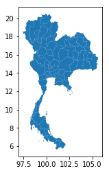
Thailand map
# original data from https://github.com/apisit/thailand.json
gdf = gpd.read_file('thailand.json')
gdf.columns = ['Province','geometry']

gdf.plot()
plt.show()
Thailand Referendum 2016
# original data from https://data.go.th/DatasetDetail.aspx?id=8d13d593-aea4-40b9-ad78-884da8a49e35
# note: the original data was re-encoded to utf8 to work with pandas
df = pd.read_csv('ThailandReferendum2016_regular.csv', skiprows=3, header=[0,1])


# This file only maps Thai to English version of provinces
province_pair = pd.read_csv('thaiProvinces.csv', header=None, names=['จังหวัด','Province'])

arrays = [['จังหวัด', 'ภาค', 'ผู้มีสิทธิออกเสียง', 'ผู้มาใช้สิทธิออกเสียง', 'มาใช้สิทธิ์ร้อยละ',
           'ประเด็นที่ 1 ร่างรัฐธรรมนูญ', 'ประเด็นที่ 1 ร่างรัฐธรรมนูญ', 'ประเด็นที่ 1 ร่างรัฐธรรมนูญ', 'ประเด็นที่ 1 ร่างรัฐธรรมนูญ',
           'ประเด็นที่ 2 คำถามเพิ่มเติม', 'ประเด็นที่ 2 คำถามเพิ่มเติม', 'ประเด็นที่ 2 คำถามเพิ่มเติม', 'ประเด็นที่ 2 คำถามเพิ่มเติม',
           'บัตรเสีย', 'บัตรเสียร้อยละ'],
          ['', '', '', '', '',
           'เห็นชอบ', 'เห็นชอบร้อยละ', 'ไม่เห็นชอบ', 'ไม่เห็นชอบร้อยละ',
           'เห็นชอบ', 'เห็นชอบร้อยละ', 'ไม่เห็นชอบ', 'ไม่เห็นชอบร้อยละ',
           '', '']]

tuples = list(zip(*arrays))
columns = pd.MultiIndex.from_tuples(tuples)

df.columns = columns
df.columns = [' '.join(col).strip() for col in df.columns.values]
columns = np.insert(df.columns.values, 1, 'Province')

df = pd.merge(df, province_pair, 'inner', 'จังหวัด')
df = df[columns]
Merge geo and referendum data
gdf = pd.merge(gdf, df, 'inner', on='Province')
Relationship between province and contract
temp = govSpendCntrct[['provnc','contrct_price']].groupby('provnc').sum()
gdf = pd.merge(gdf, temp, 'inner', left_on='จังหวัด', right_index=True)
map_df = pd.merge(gdf[['Province','geometry','จังหวัด','ผู้มีสิทธิออกเสียง']], temp, 'inner', left_on='จังหวัด', right_index=True)
map_df.head(5)
Plot relationships between government spending and provinces
# import a custom made functions to plot plotly maps
# the code is available on https://github.com/clumdee/clumdee.github.io/blob/master/assets/img/open_data_thailand/plotly_map_gen.py
from plotly_map_gen import *
# for Medium

plot_data1 = []
plot_data2 = []

# column of interest
dataCol = 'contrct_price'

# polygon simplification factor
simplify_factor=0.03

# set location of the colorbar
cbar1_x = 0.33
cbar1_y = 0.25
cbar2_x = 0.74
cbar2_y = 0.25

#plot type -- 'linear' or 'log'
cbar1_type = 'linear'
cbar2_type = 'log'

# set tick locations and texts on the colorbar
cbar1_ticktext = ['1B','5B','10B','50B'] if cbar1_type=='log' else None
cbar1_tickvals = np.log10(np.array([1,2,10,50])*1e9) if cbar1_type=='log' else None
cbar2_ticktext = ['1B','5B','10B','50B'] if cbar2_type=='log' else None
cbar2_tickvals = np.log10(np.array([1,2,10,50])*1e9) if cbar2_type=='log' else None


gen_map(plot_data1, map_df, dataCol, simplify_factor, cbar1_x, cbar1_y, cbar1_type,
        cbar_tickvals=cbar1_tickvals, cbar_ticktext=cbar1_ticktext, colorbarname='Thai Baht')

gen_map(plot_data2, map_df, dataCol, simplify_factor, cbar2_x, cbar2_y, cbar2_type,
        cbar_tickvals=cbar2_tickvals, cbar_ticktext=cbar2_ticktext, colorbarname='Thai Baht')

##################

fig = tools.make_subplots(rows=1, cols=2, specs=[[{}, {}]],
                          subplot_titles=('Linear-scale', 'Log-scale'))

for e1, e2 in zip(plot_data1,plot_data2):
    fig.append_trace(e1, 1, 1)
    fig.append_trace(e2, 1, 2)

fig['layout'].update(hovermode = 'closest', height=466, width=700,
                     title='Sum government spending by province <br>' +
                     '({} to {})'.format(start_date, end_date),
                     xaxis1 = {'anchor': 'y1', 'domain': [0.15, 0.44]},
                     xaxis2 = {'anchor': 'y2', 'domain': [0.56, 0.85]}
                    )

fig['layout']['annotations'][0]['x'] = 0.29
fig['layout']['annotations'][1]['x'] = 0.72

py.iplot(fig)
Plot relationships between government spending per eligible voter and provinces
map_df['contrct_price_per_eligible_voter'] = map_df['contrct_price']/map_df['ผู้มีสิทธิออกเสียง']
# for Medium

plot_data3 = []
plot_data4 = []

# column of interest
dataCol = 'contrct_price_per_eligible_voter'

# polygon simplification factor
simplify_factor=0.03

# set location of the colorbar
cbar3_x = 0.33
cbar3_y = 0.25
cbar4_x = 0.74
cbar4_y = 0.25

#plot type -- 'linear' or 'log'
cbar3_type = 'linear'
cbar4_type = 'log'

# set tick locations and texts on the colorbar
cbar3_ticktext = ['2k','5k','10k'] if cbar1_type=='log' else None
cbar3_tickvals = np.log10(np.array([2,5,10])*1e3) if cbar3_type=='log' else None
cbar4_ticktext = ['2k','5k','10k'] if cbar2_type=='log' else None
cbar4_tickvals = np.log10(np.array([2,5,10])*1e3) if cbar4_type=='log' else None


gen_map(plot_data3, map_df, dataCol, simplify_factor, cbar3_x, cbar3_y, cbar3_type,
        cbar_tickvals=cbar3_tickvals, cbar_ticktext=cbar3_ticktext, colorbarname='Thai Baht')

gen_map(plot_data4, map_df, dataCol, simplify_factor, cbar4_x, cbar4_y, cbar4_type,
        cbar_tickvals=cbar4_tickvals, cbar_ticktext=cbar4_ticktext, colorbarname='Thai Baht')

##################

fig = tools.make_subplots(rows=1, cols=2, specs=[[{}, {}]],
                          subplot_titles=('Linear-scale', 'Log-scale'))

for e1, e2 in zip(plot_data3,plot_data4):
    fig.append_trace(e1, 1, 1)
    fig.append_trace(e2, 1, 2)

fig['layout'].update(hovermode = 'closest', height=466, width=700,
                     title='Sum government spending per eligible voter by province <br>' +
                     '({} to {})'.format(start_date, end_date),
                     xaxis1 = {'anchor': 'y1', 'domain': [0.15, 0.44]},
                     xaxis2 = {'anchor': 'y2', 'domain': [0.56, 0.85]}
                    )

fig['layout']['annotations'][0]['x'] = 0.29
fig['layout']['annotations'][1]['x'] = 0.72

py.iplot(fig)
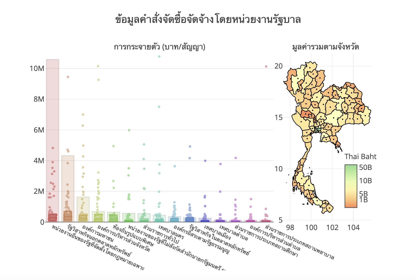
Creating an opening plot – combining different types of plots
# re-create this placeholder plot with correct locations of text, labels, colorbar, etc.

plot_data2 = []

# column of interest
dataCol = 'contrct_price'

# polygon simplification factor
simplify_factor=0.03

# set location of the colorbar
cbar2_x = 0.9
cbar2_y = 0.25

#plot type -- 'linear' or 'log'
cbar1_type = 'linear'
cbar2_type = 'log'

# set tick locations and texts on the colorbar
cbar2_ticktext = ['1B','5B','10B','50B'] if cbar2_type=='log' else None
cbar2_tickvals = np.log10(np.array([1,2,10,50])*1e9) if cbar2_type=='log' else None

gen_map(plot_data2, map_df, dataCol, simplify_factor, cbar2_x, cbar2_y, cbar2_type,
        cbar_tickvals=cbar2_tickvals, cbar_ticktext=cbar2_ticktext, colorbarname='Thai Baht')
fig = tools.make_subplots(rows=1, cols=2, specs=[[{}, {}]],
                          subplot_titles=('การกระจายตัว (บาท/สัญญา)',
                                          'มูลค่ารวมตามจังหวัด'))

# traces were created when plotting the distribution of spending
for e1 in traces:
    fig.append_trace(e1, 1, 1)

# spending by province
for e1 in plot_data2:
    fig.append_trace(e1, 1, 2)

fig['layout'].update(hovermode = 'closest',
                     height=460, width=700, showlegend=False,
                     title='ข้อมูลคำสั่งจัดซื้อจัดจ้างโดยหน่วยงานรัฐบาล <br>' +
                     '({} to {})'.format(start_date, end_date),
                     xaxis1 = {'anchor': 'y1', 'domain': [0.0, 0.7]},
                     yaxis1 = {'range': [0, 11e6]},
                     xaxis2 = {'anchor': 'y2', 'domain': [0.73, 1]}
                    )

fig['layout']['annotations'][0]['x'] = 0.35
fig['layout']['annotations'][1]['x'] = 0.86
fig['layout']['annotations'][0]['font'].update({'size': 13})
fig['layout']['annotations'][1]['font'].update({'size': 13})
fig['layout']['xaxis1'].update(showticklabels=True,tickfont=dict(size=9),tickangle=25)

py.iplot(fig)